Category:
UX Designer
Client:
Google Portfolio Project
Used Tools:
Figma, Adobe XD
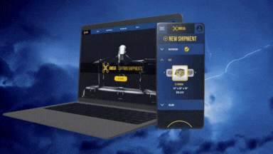
Prompted by Google’s professional certificate program, I designed a frustration-free checkout flow for placing a shipping order with a company that uses drones.
The Results


Who Doesn't Hate Forms?
I can’t tell you how many times I’ve given up on a form that was both too long, and lacked any kind of progress indicator. It was time to create a form that solved this problem.
The Plan to Make a Change
Beginning with empathy, I planned to create user personas, study common shipping forms from companies like FedEx and USPS. Next, I’d draw site maps, paper wireframe, and then create testable low fidelity designs before finalizing with a high fidelity.
How Things Went
I learned a few things on this project. One is that though some fonts are fun, they aren’t super readable. I changed body text BC Alphapipe to Futura, because it was simply tough to read in a paragraph. Word choice was more important than I realized. I had to change the label "Ship" to "New Shipment" and change "View Shipment" to "Done" to make sure the function was clear enough to users.